How to integrate Web Components using Lit in Angular
Originally published at labs.thisdot.co
Oct 14, 2021 · 6 minutes read · Follow @luixaviles
In previous posts, I explained how to create projects in Lit and TypeScript from scratch. Also, I covered different topics about Web Components, and Single-Page Applications, using them.
In this tutorial, I’ll explain the needed steps to integrate these Web Components in Angular. Spoiler: You can find the source code of a demo project at the end.

Project Setup
Prerequisites
You’ll need to have installed the following tools in your local environment:
- Node.js. Preferably the latest LTS version.
- A package manager. You can use either NPM or Yarn. This tutorial will use NPM.
Creating the Angular Project
Let’s create a project from scratch using the Angular CLI tool.
ng new angular-lit-web-components --routing --prefix corp --style css --skip-tests
This command will initialize a base project using some configuration options:
--routing. It will create a routing module.--prefix corp. It defines a prefix to be applied to the selectors for created components(corpin this case). The default value isapp.--style css. The file extension for the styling files.--skip-tests. It avoids the generations of the.spec.tsfiles, which are used for testing.
Install Lit
Lit is a simple library for building fast, lightweight web components.
Lit is available via npm, let’s install it as a new dependency for the current project.
npm install --save lit
Find more information about Lit here.
Install Web Components Polyfills
There are several ways to install the Web Components polyfills. In this case, we’ll install it using npm.
npm install --save @webcomponents/webcomponentsjs
Then you can use the webcomponents-loader.js, which allows loading a minimum polyfill bundle.
Update the Angular Configuration
You can load the polyfills using a <script> tag into the index.html file. However, the Angular way to do it is by adding a new asset and script configurations into your angular.json file as follows:
"architect": {
  "build": {
    ...
    "options": {
      ...
      "assets": [
        "src/favicon.ico",
        "src/assets",
        {
          "glob": "{*loader.js,bundles/*.js}",
          "input": "node_modules/@webcomponents/webcomponentsjs",
          "output": "node_modules/@webcomponents/webcomponentsjs"
        }
      ],
      "scripts": [
        "node_modules/@webcomponents/webcomponentsjs/webcomponents-loader.js"
      ]
      ...
    },
    "configurations": {
      ...
    },
      ...
  },
 }
Both input and output properties must be relative to the project’s root path. The same applies to the script imported.
Creating your Web Components using Lit
The project setup has been completed, and now it’s time to create our first web component using Lit.
Let’s create an src/web-components/card-user folder, and then create two files: card-user.ts and user.ts.
The user.ts file will define a common model used by the Web Component implementation, and the Angular project:
// user.ts
export interface User {
  id: number;
  fullName: string;
  role: string;
  avatar?: string;
}
Next, let’s define the TypeScript code for our Web component into card-user.ts
file:
// card-user.ts

import { LitElement, html, css } from 'lit';
import { property, customElement } from 'lit/decorators.js';
import { User } from './user';

@customElement('card-user')
export class CardUser extends LitElement {
  static styles = css`
    :host {
      display: block;
    }
    .card {
      box-shadow: 0 10px 10px 0 rgba(0, 0, 0, 0.5);
      max-width: 160px;
    }
    .card-content {
      padding: 10px;
    }
  `;

  @property({ type: Object }) user?: User = {
    id: 0,
    fullName: 'Luis Aviles',
    role: 'Software Engineer',
  };

  render() {
    if (this.user === undefined) {
      return '';
    }

    return html`
      <div class="card">
        <img
          width="160px"
          src=${this.user.avatar
            ? this.user.avatar
            : 'assets/images/avatar.png'}
        />
        <div class="card-content">
          <h4>${this.user.fullName}</h4>
          <p>${this.user.role}</p>
          <button @click=${this.handleEdit}>Edit</button>
        </div>
      </div>
    `;
  }

  private handleEdit() {
    this.dispatchEvent(
      new CustomEvent<User>('edit', {
        detail: this.user,
      })
    );
  }
}
The previous class defines a new custom element as a brand new widget for our project.
- The
@customElementdecorator allows the component definition using a name for it:card-user. It is applied at the class level. - The
static stylesattribute defines the styles for the component using a tagged template literal (css). - The
@propertydecorator, which allows declaring properties for the custom element in a readable way. - The
rendermethod returns the HTML content through a template literal (html). This function will be called any time theuserproperty changes.
You can read more about how to define a component using Lit here.
Using Web Components in Angular
Import the Web Component
Before using any Web Component in an Angular component, we’ll need to make sure to import its definition as follows.
// app.component.ts

import { Component } from '@angular/core';

import '../web-components/card-user/card-user'; // <-- import the web component

@Component({
  selector: 'corp-root',
  templateUrl: './app.component.html',
  styleUrls: ['./app.component.css'],
})
export class AppComponent {}
Use the Custom Element
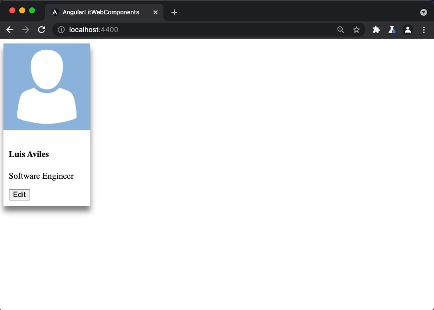
The next step is to use the brand-new custom element <card-user> as part of any template. In this case, let’s use it in our app.component.html file:
<card-user></card-user>
Once you save these changes, you may find an error in your command-line interface (the place where you’re running ng serve).
Error: src/app/app.component.html:1:1 - error NG8001: 'card-user' is not a known element:
1. If 'card-user' is an Angular component, then verify that it is part of this module.
2. If 'card-user' is a Web Component, add 'CUSTOM_ELEMENTS_SCHEMA' to the '@NgModule.schemas' of this component to suppress this message.

1 <card-user></card-user>
  ~~~~~~~~~~~

  src/app/app.component.ts:7:16
    7   templateUrl: './app.component.html',
                     ~~~~~~~~~~~~~~~~~~~~~~
    Error occurs in the template of component AppComponent.
Fortunately, the previous error message is significant enough to understand that we’ll need to apply a change in the app.module.ts file, which is the main module of our application.
// app.module.ts

import { NgModule, CUSTOM_ELEMENTS_SCHEMA } from '@angular/core';
import { BrowserModule } from '@angular/platform-browser';

import { AppRoutingModule } from './app-routing.module';
import { AppComponent } from './app.component';

@NgModule({
  declarations: [AppComponent],
  imports: [BrowserModule, AppRoutingModule],
  providers: [],
  bootstrap: [AppComponent],
  schemas: [CUSTOM_ELEMENTS_SCHEMA],
})
export class AppModule {}
The important part here is to import the CUSTOM_ELEMENTS_SCHEMA from the @angular/core package, and then use it in the schemas property. You can find more information about it here.
Save your changes again, and the magic will happen :-)
Using the Property Binding
It is convenient to know that we can not only import external components in our application but also make use of the Property binding.
To do that, let’s define a user property in the app.component.ts file:
// app.component.ts

export class AppComponent {
  user: User = {
    id: 2,
    fullName: 'Luis',
    role: 'Software Engineer',
    avatar: 'https://luixaviles.com/images/[email protected]',
  };
}
Then, we can update the related template, and use the brackets notation to bind the property:
<card-user [user]="user"></card-user>
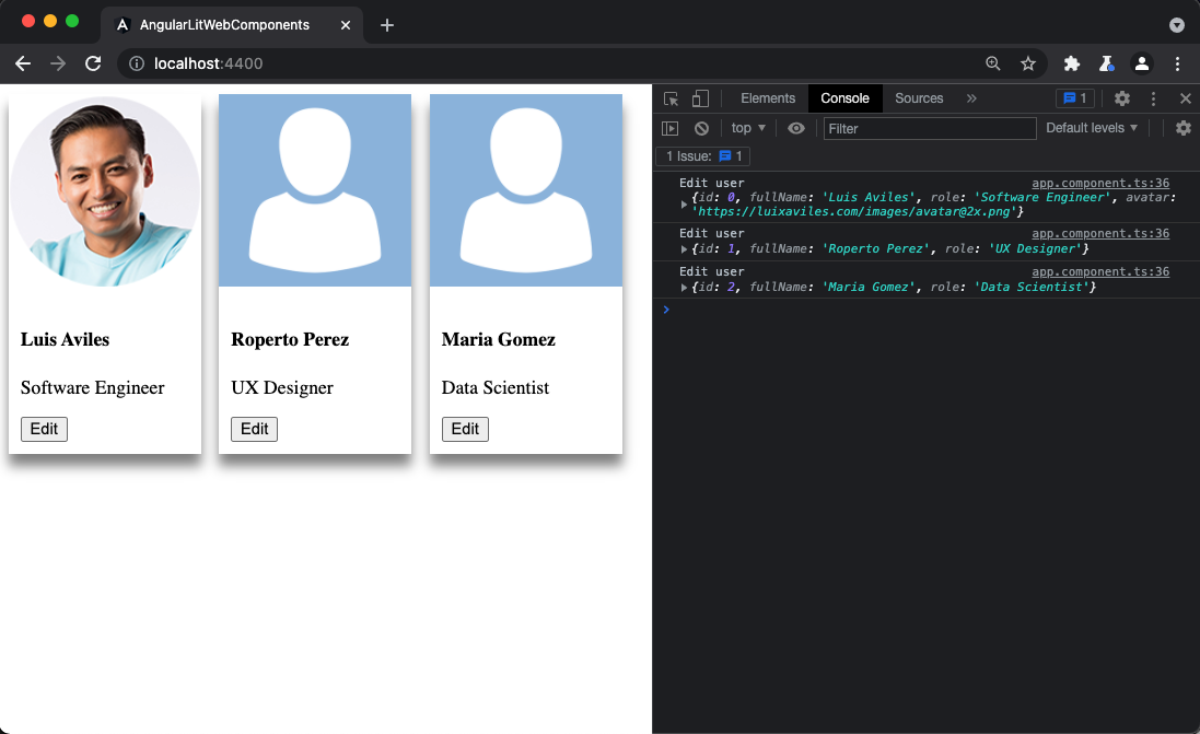
Even better, you can create an array of users to be able to render them using other nice features from our favorite framework, such as the structural directive *ngFor.
<card-user *ngFor="let user of users" [user]="user"> </card-user>
Using the Event Binding
It’s time to listen and respond to user actions through the Event binding with Angular. As you saw before, the corp-user component is able to dispatch an edit event once the “Edit” button is clicked.
Let’s use the parentheses notation this time to bind a method:
<card-user *ngFor="let user of users" [user]="user" (edit)="edit($event)">
</card-user>
Finally, let’s create the edit method in our component.
// app.component.ts

//...
export class AppComponent {
  //...

  edit(event: Event) {
    const user = (event as CustomEvent<User>).detail;
    console.log('Edit user', user);
  }
}
The edit method receives a generic Event. However, the Custom Element has sent a User object through the CustomEvent detail. Then, we can use the as syntax operator from TypeScript and get access to it using the detail property. The next screenshot shows the results in the browser’s console.
Source Code of the Project
Find the complete project in this GitHub repository: angular-lit-web-components. Do not forget to give it a star ⭐️ and play around with the code.
Feel free to reach out on Twitter if you have any questions. Follow me on GitHub to see more about my work.