How to Build a Slideshow App Using Swiper and Angular
Originally published at labs.thisdot.co
Mar 23, 2022 · 6 minutes read · Follow @luixaviles
Google Slides and Microsoft PowerPoint are the most popular options to build presentations nowadays. However, have you ever considered having a custom tool where you can use your web development knowledge to create beautiful slides?
In this post, we will build a slideshow app with the ability to render one slide at a time using Angular, Swiper, and a little bit of CSS.
Project Setup
Prerequisites
You’ll need to have installed the following tools in your local environment:
- Node.js. Preferably the latest LTS version.
- A package manager. You can use either NPM or Yarn. This tutorial will use NPM.
Creating the Angular Project
Let’s start creating a project from scratch using the Angular CLI tool.
ng new slideshow-angular-swiper --routing --prefix corp --style scss --skip-tests
This command will initialize a base project using some configuration options:
--routing. It will create a routing module.--prefix corp. It defines a prefix to be applied to the selectors for created components(corpin this case). The default value isapp.--style scss. The file extension for the styling files.--skip-tests. it avoids the generations of the.spec.tsfiles, which are used for testing
Creating the Slides Component
We can create a brand new component to handle the slides content of the application. We can do that using the command mg generate as follows.
ng generate component slides
The output of the previous command will show the auto-generated files.
Update the Routing Configuration
Remember we used the flag --routing while creating the project? That parameter has created the main routing configuration file for the application: app-routing.module.ts. Let’s update it to be able to render the slides component by default.
// app-routing.module.ts
import { SlidesComponent } from './slides/slides.component';

const routes: Routes = [
  {
    path: '',
    redirectTo: 'slides',
    pathMatch: 'full',
  },
  {
    path: 'slides',
    component: SlidesComponent,
  },
];
Update the App Component template
Remove all code except the router-outlet placeholder:
<!-- app.component.html -->
<router-outlet></router-outlet>
This will allow rendering the slides component by default once the routing configuration is running.
Using Swiper
What is Swiper?
Swiper is a popular JavaScript library that lets you create transitions that can work on websites, mobile web apps and mobile native/hybrid apps.
It’s available for all modern frameworks and it’s powered with top-notch features you can find on the official website.

Installing Swiper
The plugin is available via NPM and you can use the following command to install it in the project.
npm install --save swiper
Updating the Application Module
Next, we’ll need to update the application module before starting to use Swiper.
// app.module.ts
import { SwiperModule } from 'swiper/angular';

@NgModule({
  declarations: [
    // ...
  ],
  imports: [
    //...
    SwiperModule
  ],
  providers: [],
  bootstrap: [AppComponent]
})
export class AppModule { }
Using swiper element in the Template
It’s time to work in the slide component and make use of the plugin along with the available options.
<!-- slides.component.html -->

<swiper
  [slidesPerView]="1"
  [spaceBetween]="50"
  [navigation]="true"
  [pagination]="{ type: 'fraction' }"
  [centeredSlides]="true"
  [keyboard]="{
    enabled: true
  }"
  [virtual]="true"
  class="my-swiper"
>
  <ng-template swiperSlide *ngFor="let slide of slides$ | async; index as i">
    <div class="swiper-slide-container">
      {{ slide }}
    </div>
  </ng-template>
</swiper>
For a better understanding, let’s describe what’s happening in the above template:
- The
<swiper>element will create a Swiper instance to be rendered in the component. - slidesPerView will set the number of slides visible at the same time.
- navigation will render the navigation buttons to slide to the left and right.
- pagination will set the pagination configuration through an object.
- keyboard will enable navigation through the keyboard.
- virtual will enable the virtual slides feature. This is important in case you have several slides and you want to limit the amount of them to be rendered in the DOM.
- class will set a class to customize the styling.
- swiperSlide is an Angular directive that helps to render a slide instance.
One important note here is the custom container created under the swiperSlide directive allows customize the way we can render every slide. In this case, it’s used to set a layout for every slide and make sure to render it centered, and using the whole height of the viewport.
Set the Swiper Configuration
As you may note, the template will require additional configurations and we’ll need to create a couple of slides for the component.
// slides.component.ts

import { Component, OnInit, ViewEncapsulation } from '@angular/core';
import { BehaviorSubject } from 'rxjs';

import SwiperCore, { Keyboard, Pagination, Navigation, Virtual } from 'swiper';

SwiperCore.use([Keyboard, Pagination, Navigation, Virtual]);

@Component({
  selector: 'corp-slides',
  templateUrl: './slides.component.html',
  styleUrls: ['./slides.component.scss'],
  encapsulation: ViewEncapsulation.None,
})
export class SlidesComponent implements OnInit {

  slides$ = new BehaviorSubject<string[]>(['']);

  constructor() {}

  ngOnInit(): void {
    this.slides$.next(
      Array.from({ length: 600 }).map((el, index) => `Slide ${index + 1}`)
    );
  }
}
In the above code snippet, the component imports the SwiperCore class along with the required modules. Next, the component needs to install those using a SwiperCore.use([]) call.
Later, a BehaviorSubject is created to emit all slides content once the component gets initialized.
Using Swiper Styles
Since the current application is configured to use SCSS styles, we’ll need to import the following styles into the slides.component.scss file:
/* slides.component.scss */

@import 'swiper/scss';
@import 'swiper/scss/navigation';
@import 'swiper/scss/pagination';
Of course, these imports will work with the latest version of Swiper(version 8 at the time of writing this article).
However, some users have found some issues while importing Swiper styles(mainly after doing an upgrade from Swiper v6 and v7). For example:
Error: Module not found: Can't resolve 'swiper/css'
or an error like this:
Error: Module build failed (from ./node_modules/sass-loader/dist/cjs.js):
SassError: Can't find stylesheet to import.
If you got any of those issues you can give it a try with the following imports instead:
/* slides.component.scss */

@import '~swiper/swiper.min.css';
@import '~swiper/modules/navigation/navigation.min.css';
@import '~swiper/modules/pagination/pagination.min.css';
For the purpose of this demo, we’ll attach additional styling to make it work:
/* slides.component.scss */

.my-swiper {
    height: 100%;
}

.swiper-slide-container {
  display: flex;
  justify-content: center;
  align-items: center;
  text-align: center;
  background: #fff;
  height: 100%;
  max-width: 600px;
  margin: auto;
  border-radius: 20px;
}
The .my-swiper selector will set the appropriate height for every slide. On other hand, the .swiper-slide-container selector will provide a layout as a slide container.
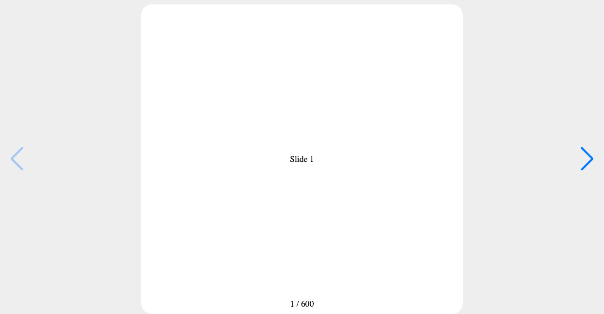
And this is how it will look on your web browser.

Live Demo and Source Code
Wanna play around with the final application? Just open the following link in your browser: https://luixaviles.github.io/slideshow-angular-swiper.
Find the complete angular project in this GitHub repository: slideshow-angular-swiper. Do not forget to give it a star ⭐️ and play around with the code.
Feel free to reach out on Twitter if you have any questions. Follow me on GitHub to see more about my work.